5 Websites with inspiring User Interface (UI) Design
We’ve all encountered websites and applications that make us want to throw our devices across the room in frustration. At least, I hope it’s not just me. Fundamentally, a good user interface enables users to complete the activity that they came to the website to do with ease and without confusion.
Truly great UI achieves this and more. Really exceptional user interfaces will not just please the user by facilitating the frictionless achievement of the task at hand—they will also please them aesthetically and experientially.
And that could mean any number of things: a slick, original animated interaction that intuitively draws the user’s attention to a certain element, or an uncluttered, clean design and clever use of white space that imbues the user with a sense of calm, for example.
Select an example below to jump straight to it, or read on and let me know whether you agree—or not—in the comments.
1. Medium
2. Virgin Hotels
3. Airbnb
4. Boosted Boards
5. Dropbox
So, if you’re wondering how to evaluate whether a user interface is good—or even great—how do you decide? I mean, you can determine whether you find a user interface visually appealing, and you can of course use the interface to ascertain whether it’s an intuitive, straightforward experience. But is there anything more objective? More formalized?
How do you know if the UI design of a website is good?
Personally, I always refer back to the usability characteristics defined by the research company Nielsen Norman Group.
Nielsen defines Usability through the following five characteristics; learnability, efficiency, memorability, errors and satisfaction.
- Learnability: Can the user complete their tasks with little difficulty?
- Efficiency: Does the interface allow the user to complete tasks in a timely manner?
- Memorability: After leaving a website, how likely will the user be able to remember how to use it the next time they visit?
- Errors: What steps does the interface take to lessen the chance of user error, and how do they let the users correct an error?
- Satisfaction: Does the user enjoy interacting with the design?
And on top of those standards, a great UI should also reflect the personality of the brand in order to stand out from the competition and provide users with a delightful experience. So let’s check out a few examples of where I think companies have gotten their UI spot on.
1. Medium
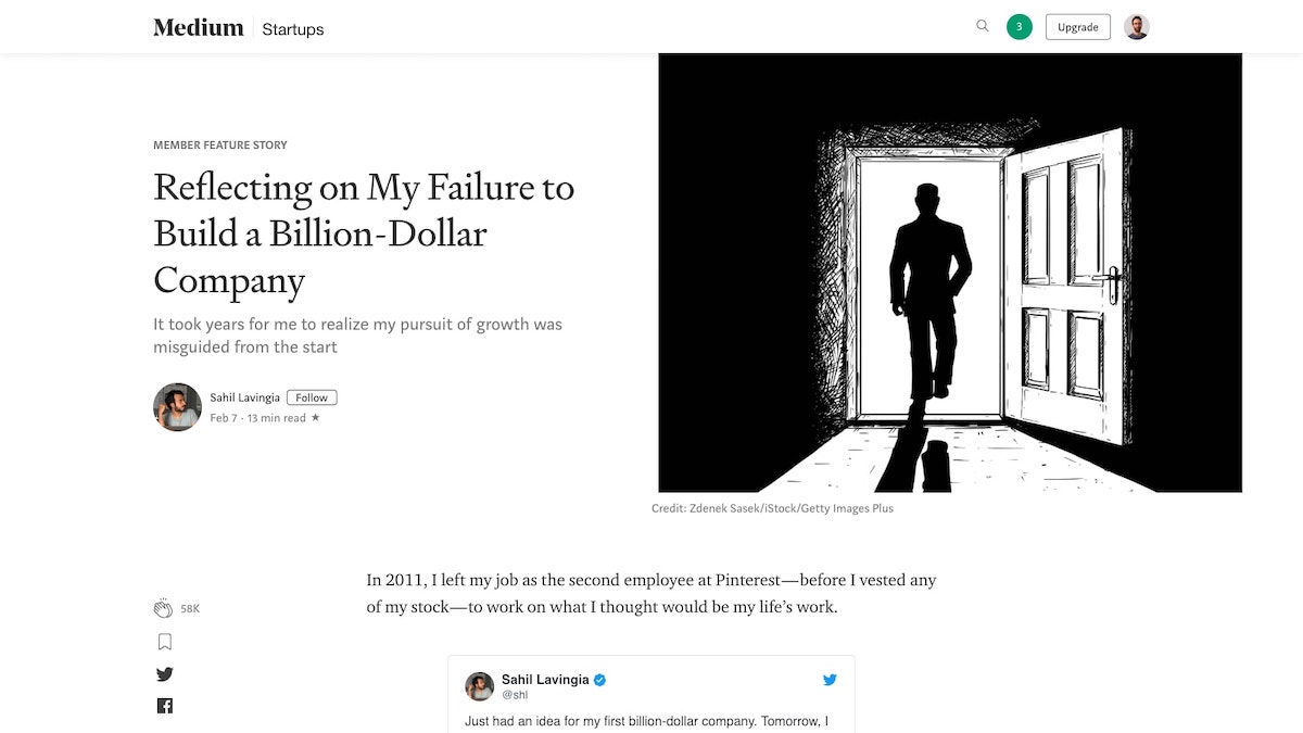
Medium, an online reading and publishing platform, is just as gorgeous as it is functional. With minimal use of color, generous line spacing, and a well chosen combination of typography, this website gets everything right.
With Medium, content is king. Once a user is logged in, a box appears at the top of the article list with the text “Write here”, enabling and encouraging everyone to get writing quickly. When users click on the “Write a Story” link, they are presented with an almost empty white page, removing clutter and simply providing a clean space to focus on writing.
Articles are set up in a one column format, making content easy to digest. With little touches like estimated read time and the ability to highlight and respond directly to specific pieces of articles, Medium truly provides users with an amazing and effortless editorial experience.
2. Virgin America
Bear with me on this one. Just for a moment.
When it comes to helping users complete the process of booking a flight, Virgin America was one of the first – if not the first – to put the user’s interests front and centre. For most, booking a flight is a chore. Much like a dishwasher relieves us of having to scrub the dishes, Virgin America’s site stripped back their interface to draw attention to the most important question: “Where would you like to go?” By removing all the surrounding content, the user could immediately start the booking process.
And yes, the site might now look a little dated, but it deserves its place on this list as something of a trailblazer in user-centred interface design. Unfortunately, since merging with Alaska Air, their approach to UI has become decidedly more cluttered.
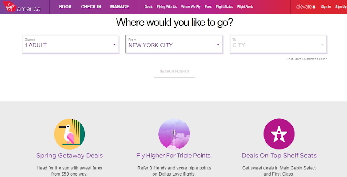
Back to what made Virgin America’s site great though: Throughout the entire process of booking, the user was reminded of their selection by a bar at the top of the screen showing their current choices. By keeping this information visible, Virgin made it easy for users to constantly see and edit their choices instead of relying on them to recall the information themselves. The UI here was clearly designed to ensure that a user can focus on completing their goal as quickly and efficiently as possible.
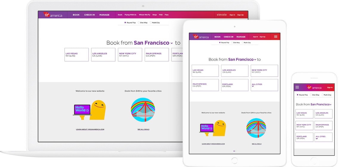
Source: Work & Co
Virgin also made sure to stand out visually from the competition. The use of bright colors, gradients, and fun illustrations created a unique brand personality and experience that sets them apart from other competitors’ websites.
3. Airbnb
The UI of Airbnb does two things very well: booking a place to stay, and creating trust between two complete strangers.
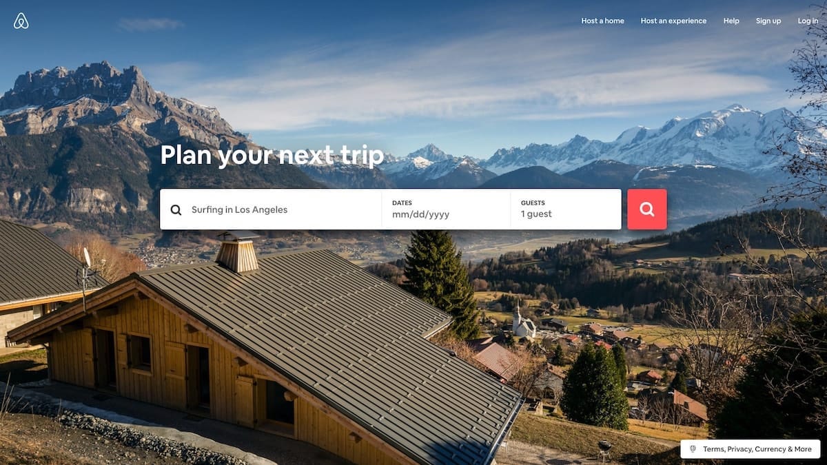
Airbnb, much like Virgin America, has prioritized making it easy to start booking a stay right from the home screen. Paired with its characteristic use of conversational copy, such as the “What can we help you find, Edward?” below, and helpful cue text, a user is simultaneously and courteously invited and directed to start planning their stay.
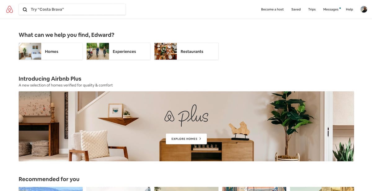
This conversational invite to start searching is a delightful way of portraying the voice of the brand, as well as making the process of finding a place to stay simple. The only fields you need to specify during this initial search are: choosing a destination users would like to go, along with the duration of their stay and the number of guests. By leaving out the additional filters until the next step, the process is streamlined, friendly and approachable.
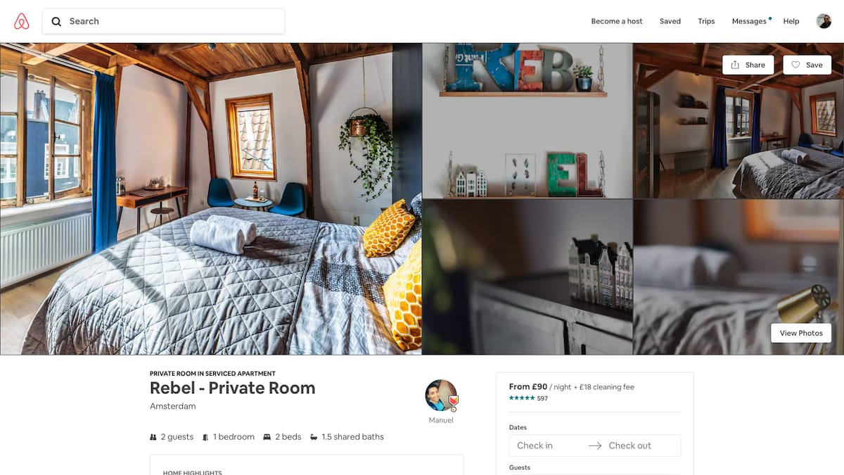
The listing pages are complete with a description of any additional fees that may be included. This is a very straightforward, easy process for just about any user. The ‘Request to Book’ button sits right under this, and being one of the brightest buttons on the page, invites users to click it in order to finalize their stay.
After a user has requested to book a location, they are taken to a new checkout page. The listing, pricing and booking information sits to the right of the page to reduce the need for the guest to retain the information from the previous page.
On the left, instead of getting right into the payment, the page prompts you to “say hello to your host and tell them why you’re coming”. By placing this prior to the payment information, it starts a conversation and connection between the guest and host, and further invests the user in the experience. Airbnb takes pride in bringing people together and gives the conversation importance over the transaction – the UI reflects this perfectly.
Airbnb has cleverly thought out its copy and used engaging photos and videos to ensure that the interface conveys an emotional tone that helps create a sense of trust between strangers.
4. Boosted Boards
Now this is a website with personality. Upon arrival, users are immediately greeted with an explosive, fun-filled, dynamic video of the product in use. You’re enraptured by a characterful skateboard on its very own trip, twisting and turning, multiplying, before disintegrating into its component parts – it’s quite a ride. And then you notice the “Shop Now” call-to-action, sitting patiently right at the center of your screen.
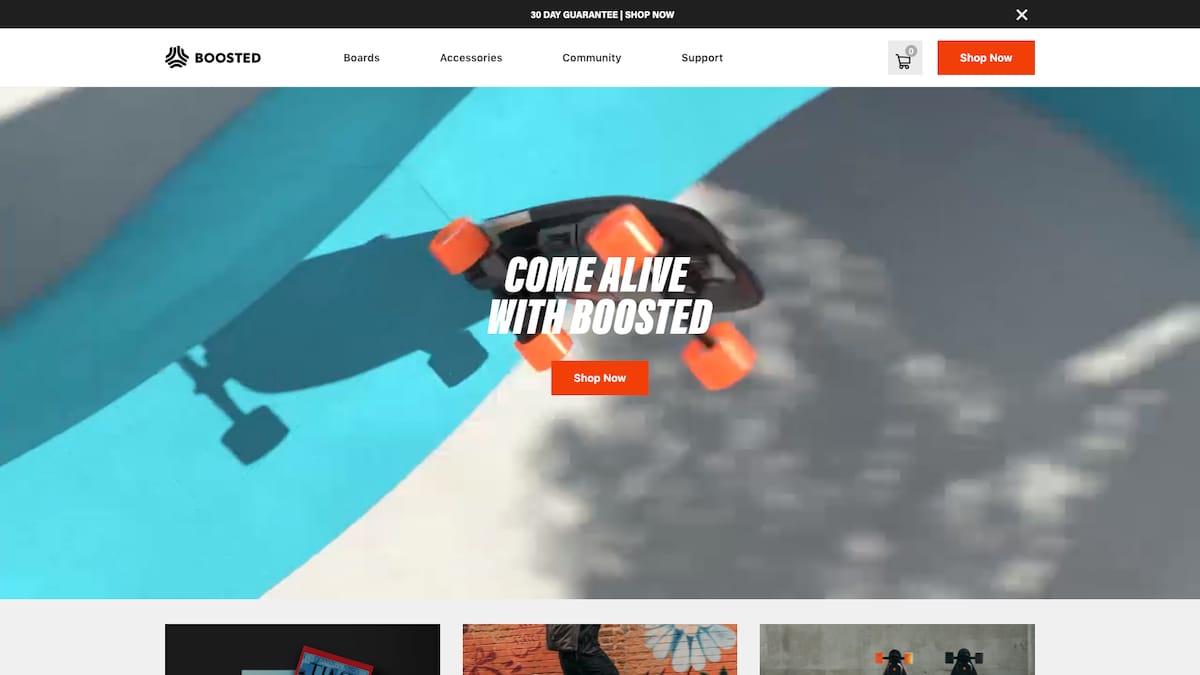
You’re suitably impressed, inquisitive, and now it’s time to see what’s behind all this bravado. A click on the “Shop Now” gets you down to business—the interface is stripped of color but for the luminous orange wheels of the board, and you’re delivered only the most relevant information: image, top speed, range, price, shipping time, and, of course, “Buy Now”. What’s stopping you? Very little.
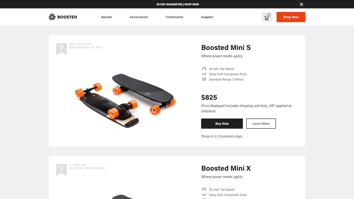
Not yet convinced? A click on “Learn More” will deliver all the information you need to take you from consideration to awareness: Key product features are broken down expertly into image, text and graphic components that support one another. As you scroll down further, positive product reviews and finance offerings reduce anxiety by reducing the sense of risk. All in all, it’s a great lesson in how to combine different graphic and text elements to generate a convincing whole.
5. Dropbox
Dropbox has one of the most easily understandable interfaces by far. Having a folder and file organizational structure is easily recognizable to, you know, anyone who’s ever used a computer before. In terms of learnability, there isn’t much that the average user won’t already know how to do from the start. It’s natural for most users to try dragging and dropping files from their desktops to the page without them even knowing if it’s possible or not, just because it’s so familiar.
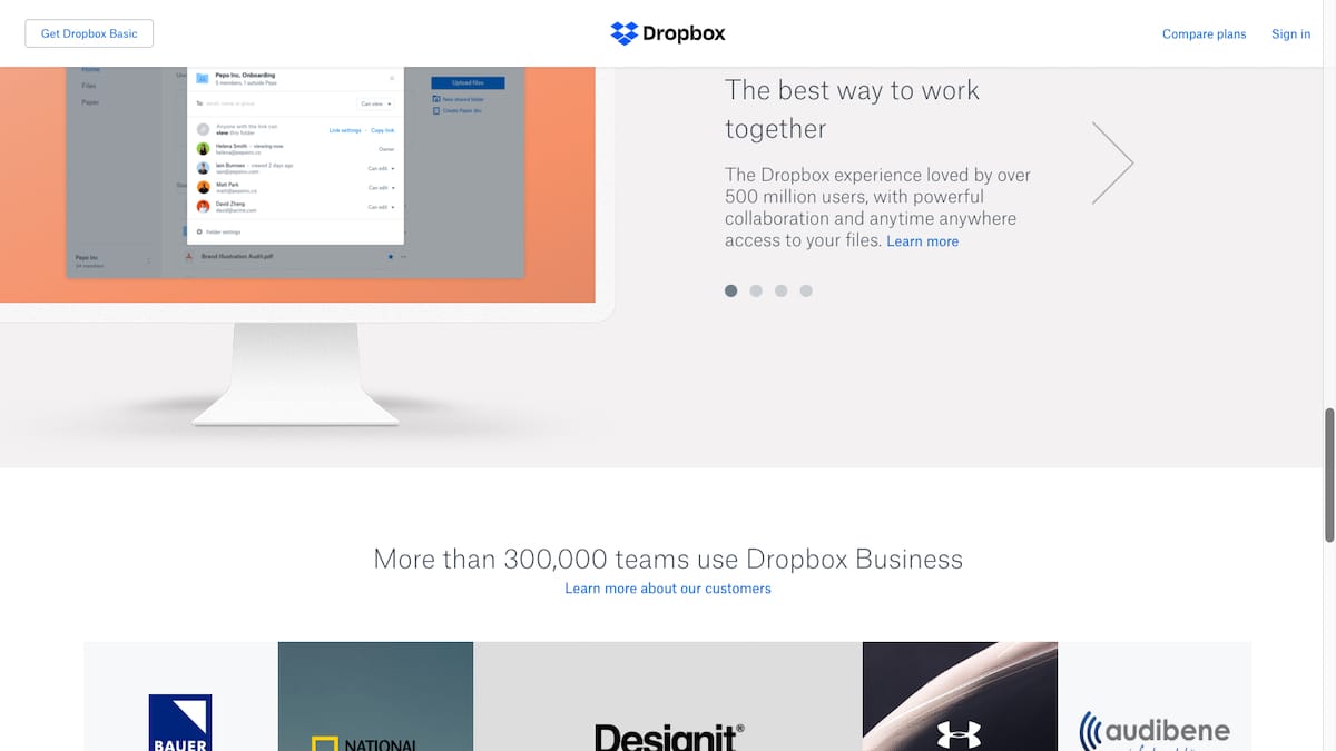
Dropbox’s friendly personality, created by lighthearted illustrations, helps the user feel comfortable when using the product. This addition to the interface makes the product feel like an old friend, ready to help users complete their file sharing tasks.
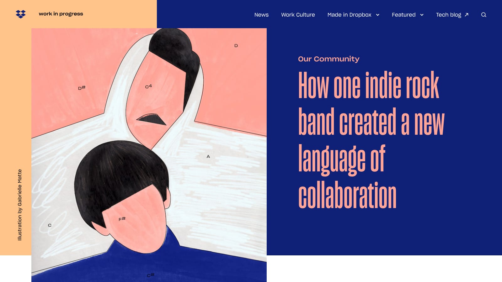
And they have – possibly – the best blog design in the world right now. I know, I know, there’s a healthy dose of subjectivity in a comment like that, but rarely have I seen such a successful mix of experimental UI, usability and multimedia content in one place.
There’s so much attention to detail, with sequenced color palettes and animated icons, and wonderful illustration that is coordinated with all the other wonderful illustrations – it manages to come across as experimental, creative and consistent. That’s quite an achievement! Check it out!
