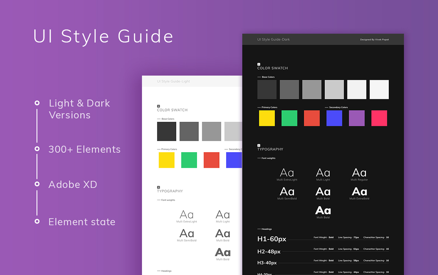
How to create a UI Style Guide for Better User Experience
Designers and developers of today’s digital experiences face a similar challenge. The passage of time is a formidable foe capable of wreaking havoc on the continuity of digital products. With time, team members come and go, trends evolve, and features change. Plus, the rapid pace of our modern day digital landscape means that product innovation occurs in quarters, not years.
If a business or design team doesn’t have a shared record that documents the intended look and feel a product, visual and experiential inconsistencies will arise, users will grow frustrated, and the brand’s reputation will take a hit.
UI Style Guides are a design and development tool that brings cohesion to a digital product’s user interface and experience. At their core, they:
- Record all of the design elements and interactions that occur within a product
- List crucial UI components such as buttons, typography, color, navigation menus, etc.
- Document important UX components like hover states, dropdown fills, animations, etc.
- Contain live elements and code snippets for developers to reference and use
Typography Scheme
Typography is one of the most common interface design elements, so it’s not enough to merely list the names of typefaces used in a product. Clear instructions should be given for Titles, Subtitles, Headings (H1, H2, H3), Body Text, and Captions.
Responsive Layouts
When digital products are designed around responsive grid systems, UI Style Guides must address interface layouts across screen sizes. This means including notes and examples for spacing, padding, and placement. It’s also helpful to show overlays of the product’s grid system in relation to different screen sizes.
The big goal here is providing enough context to prevent the need for one-off screen designs. Over time, these add up and undermine a digital product’s cohesion.
Color Palette
One of the quickest ways to wreck an interface is inconsistent color use, so color combinations need to be clearly defined. Listing colors and their values (HEX, UIColor) is a good start, but specific pairings and use examples should also be given.
Buttons
Nearly every interface includes buttons, so take time to document their sizes, styles, colors, placement, spacing, and typographic elements. If various buttons are used in different contexts, make that clear as well.
Additional UI Components That May Be Needed
- Iconography
- Tooltips and popovers
- Modals
- Form elements
- Data Tables
- Navigation menus
- Charts and data visualizations
- Tabs
- On-off switches
- Dialogs
- Content grid lists
- Vertical lists
- Toolbars
- Date and time pickers
- Loading indicators
- Checkboxes
- Alerts
- Dropdown menus
- Sliders
- Steppers
- Pagination

