5 tips & tricks to improve your UI designs
Small and easy to put into practice tips to improve your designs.

Creating beautiful, usable, and efficient UIs takes time, with many design revisions along the way. Making those constant tweaks to produce something that your clients, users, and yourself are truly happy with. I know. I’ve been there many times before myself.
But what I’ve discovered over the years is that by making some simple visual tweaks you can quickly improve the visuals you’re trying to create.
In this article I’ve put together a small, and easy to put into practice, selection of tips that can, with little effort, not only help improve your designs today, but hopefully give you some handy pointers for when you’re starting your next project.
1. Make your elements appear more defined
Use Multiple Drop Shadows, or a very subtle border (just a shade darker than your actual shadow) around certain elements to make those elements appear a little sharper, more defined, and help avoid those muddy shadows.

2. Using just one typeface in your design is all good
It’s absolutely fine to just opt for the 1 Typeface when creating your artwork, and sometimes doing this can help you produce much stronger, and consistent results.
Ignore the ‘Always use 2 Typefaces. Minimum.’ crowd. Using a combination of Weights, Sizes, and Colour you can still produce perfectly acceptable results.

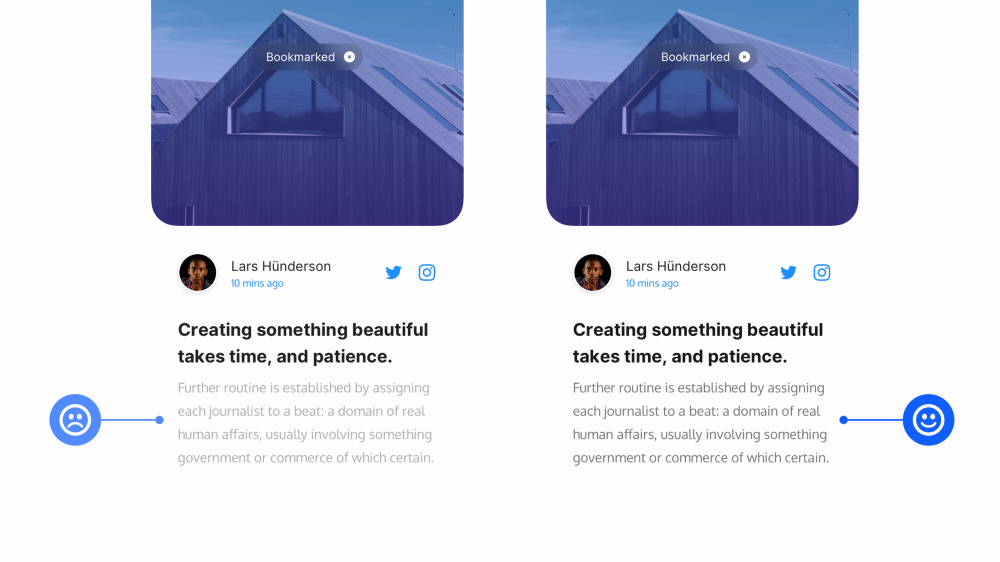
3. Creating long-form content? Give 20pt, and up a try
For long-form content (ie; Blog Posts, Project Descriptions, and all that kind of jazz), try opting for 20pt (or even a little more) with your Body copy.
Of course this is dependant on the Typeface chosen, but a good majority of popular Body Typefaces work great at 20pt, and bring a much better reading experience for the user when faced with a wall of text. 18pt is sooo last decade.

4. Improve your users’ onboarding experience
Enable users to skip your Mobile App Onboarding sequence at any time, and place that Skip link within easy thumb reach.
Thumbs still rule in 2020 remember!

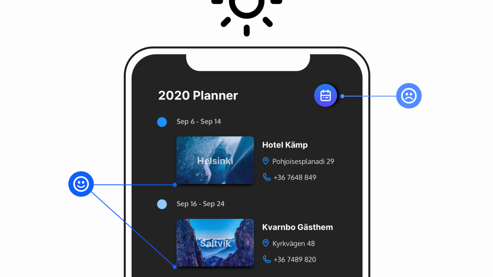
5. Your shadows are coming from one light source right?
Make sure your shadows always come from just the one light source. It’s a simple, and sometimes goes unnoticed mistake to make.
We don’t live in a land of a thousand suns remember.

